> ## Documentation Index
> Fetch the complete documentation index at: https://viewerdocs.planpoint.io/llms.txt
> Use this file to discover all available pages before exploring further.
# Analytics
> Track views, downloads, favourites and leads across your units, understand demand, and share the numbers as a PDF, spreadsheet or AI written summary
The **Analytics** module turns everything visitors do in your plan viewer into charts you can act on: which units get opened, which ones convert into leads, where your audience is, how a price change moved demand, and what buyers searched for before they ever clicked a unit.
You will find it in your dashboard sidebar under **Sales & Marketing → Analytics**. It works the same way for a single project, a group (multi-phase) and an enterprise, with a few extras that only apply to the bigger scopes.
## The headline numbers
Every Analytics page opens with five cards summarising the whole scope:
| Card | What it counts |
| --------------- | --------------------------------------------------- |
| **Total Units** | Units (or commercial spaces) currently in the scope |
| **Total Views** | Times a unit page was opened |
| **Downloads** | PDFs and other assets saved from a unit |
| **Favorites** | Units added to a visitor's shortlist |
| **Total Leads** | Information requests submitted against a unit |
Units you have excluded in the **Configuration** panel don't contribute views, downloads, favourites or leads to any chart, total or export.
## Choosing the period
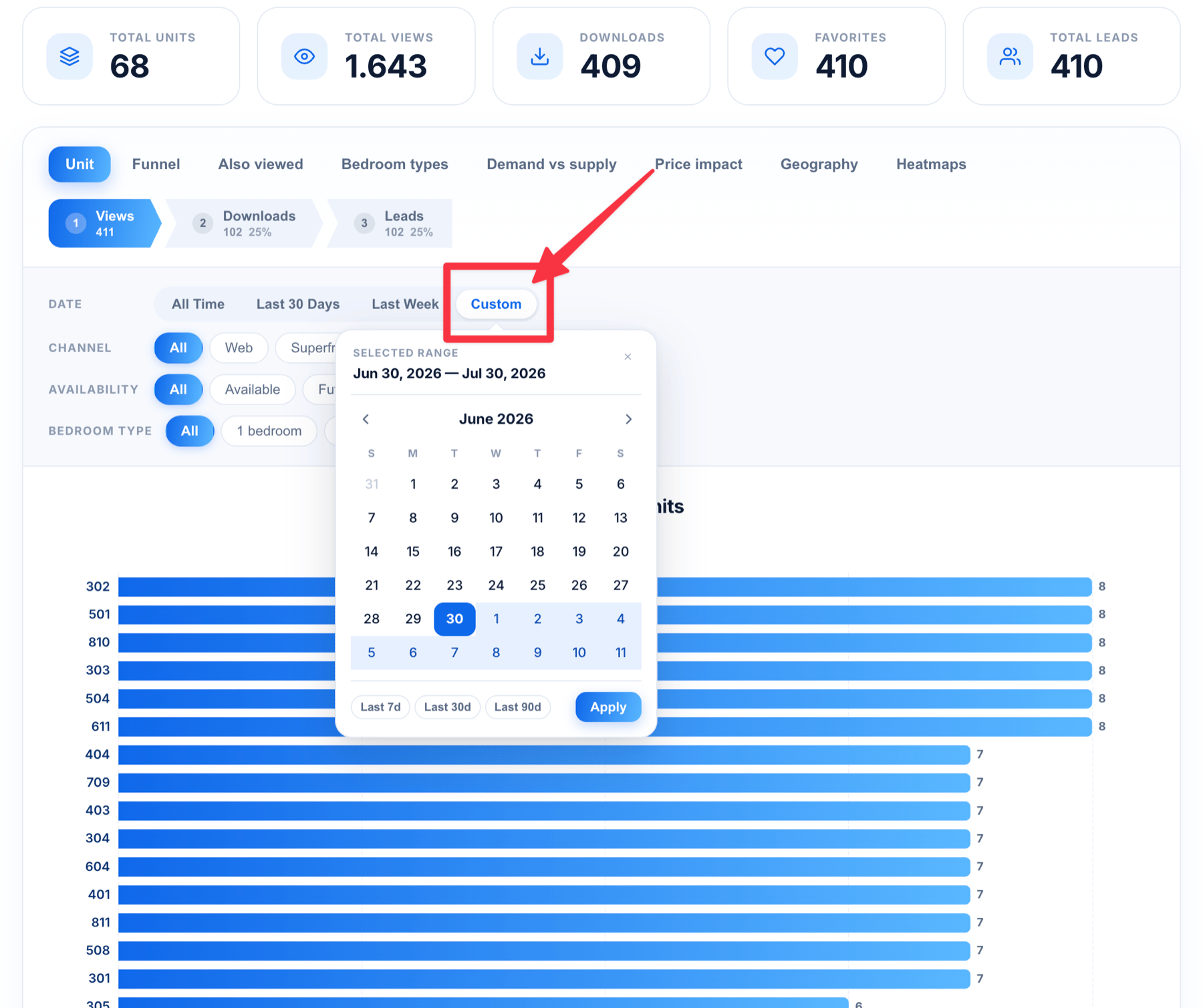
Most tabs have a **Per Date** filter with four options:
* **All Time** — everything ever recorded
* **Last 30 Days**
* **Last Week**
* **Custom** — opens a calendar so you can pick any start and end date
Click **Custom**, click a start date, then click an end date, and the charts reload for that window. Unless you change it, the custom window is the previous calendar month, which is also the period used by the monthly PDF report.
## Filtering the charts
Depending on the tab, you also get:
* **Per Availability** — narrow to a status such as Available, Reserved or Sold. The exact options come from your own units.
* **Per Bedroom Type** — narrow to studios, 1 bedroom, 2 bedrooms and so on (residential projects).
* **Per Channel** — split **Web** traffic (your public embed) from **Superframe** traffic (an in‑office sales screen). This filter only appears once at least one Superframe visit has been recorded, so projects that never ran a sales-office screen don't see an empty split.
Filters stack: pick *Last 30 Days* + *Available* + *2 bedrooms* and every chart on the tab follows.
**Price impact** and **Also viewed** have no filters. Both are calculated over fixed windows across all recorded visits, so a date filter would suggest a narrowing that doesn't actually happen.
## Paging through big charts
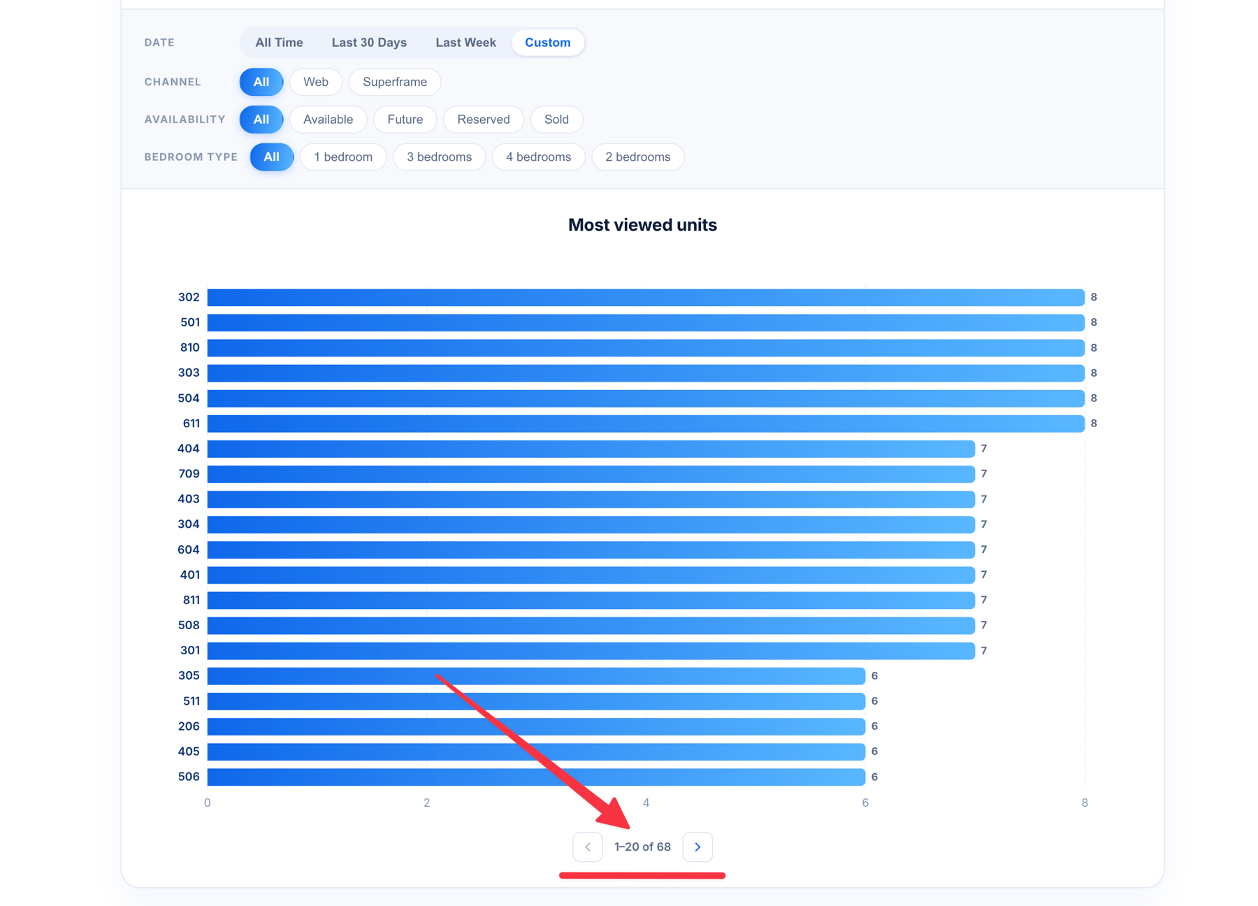
Charts show **20 rows at a time**, sorted strongest first. Underneath you'll find **Previous** / **Next** buttons and a label such as `1–20 of 576`, so you always know where you are in the list. Exports and the PDF report are not paginated, they contain the full list.
## The tabs
Tabs appear in this order. Any tab that has nothing to show is hidden automatically rather than displayed empty.
### Unit
Bar charts ranking your individual units, with three sub-tabs: **Views**, **Downloads** and **Leads**. This is the fastest way to see your best and worst performing stock.
### Funnel
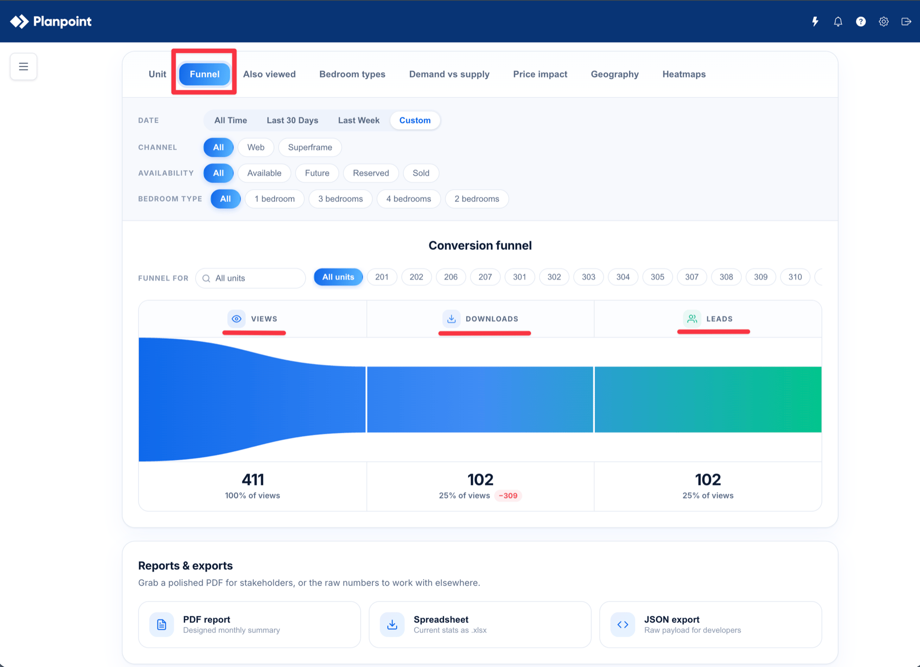
The **Conversion funnel** shows three stages, **Views → Downloads → Leads**, with each stage's total and its percentage of views (views themselves are always 100%). Use it to see where you lose people: plenty of views but almost no downloads is a very different problem from lots of downloads and no leads.
### Also viewed
"People who opened this unit also opened…". Pick a unit and see which other units share the most visitors. Great for spotting which plans compete with each other, and for suggesting a realistic second option when a buyer's first choice is gone.
This is built from an anonymous per-browser id. It never identifies a person. The tab is hidden if no visitor has opened at least two units.
### Bedroom types / Area
The same **Views / Downloads / Leads** breakdown, grouped by bedroom count. On commercial projects this tab is called **Area** instead and groups by size band: Under 500 sq ft, 500 – 1,000 sq ft, 1,000 – 2,500 sq ft, 2,500 – 5,000 sq ft and 5,000+ sq ft.
### Demand vs supply
Two views:
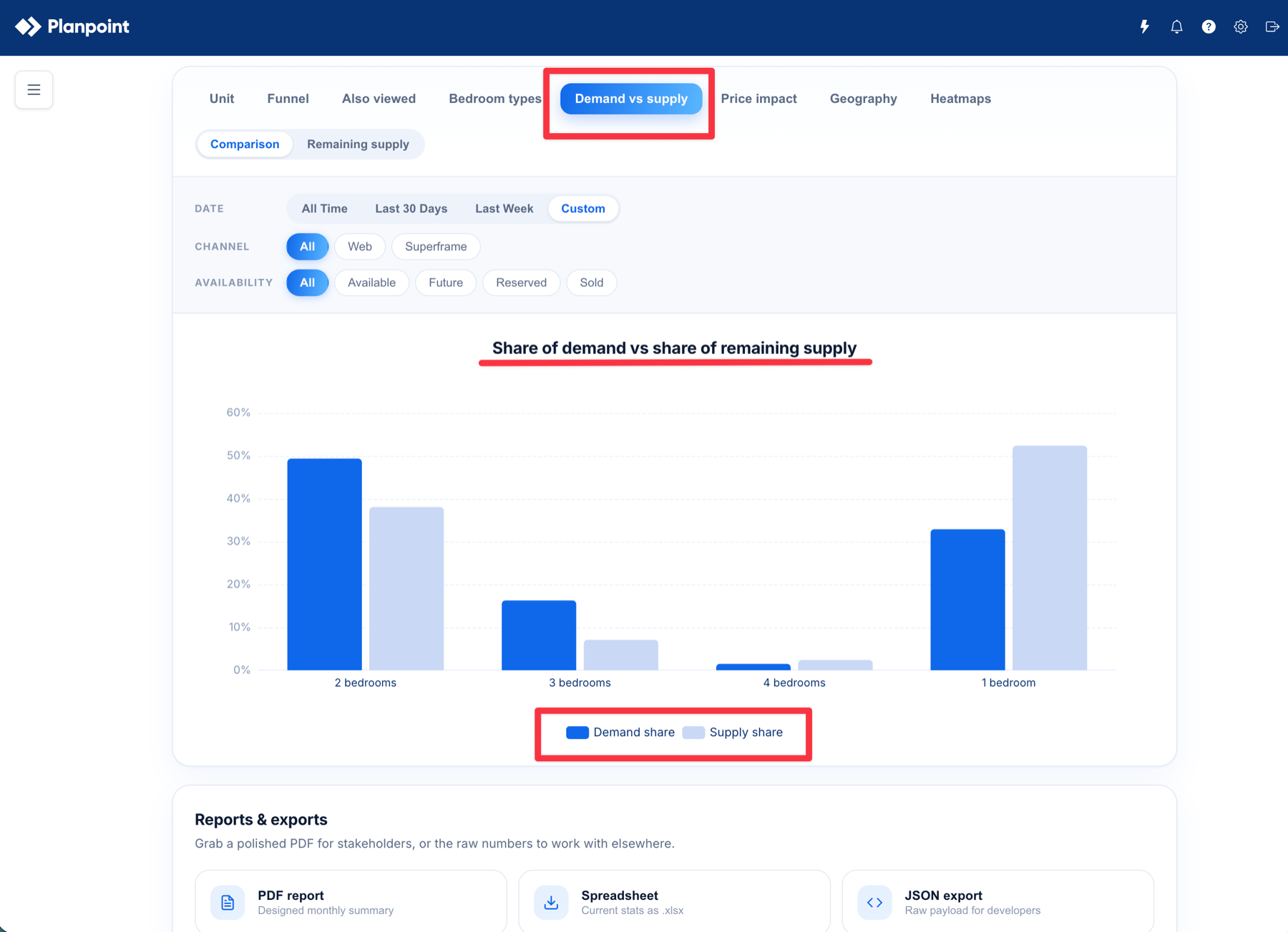
* **Comparison** — share of views (demand) against share of remaining inventory (supply), per bedroom type or area band. Where demand runs ahead of supply, you're likely underpriced or short on that type; the reverse suggests stock that needs help.
* **Remaining supply** — what's actually left, by bedroom type or area range.
Sold and leased units are not counted as remaining supply.
### Price impact
For every recorded price change, this compares views in the **14 days before** against the **14 days after**, so you can see whether a reprice actually moved demand. The tooltip shows the old and new price, the change, and views and leads either side.
The tab only appears once at least one price change has been recorded, and a unit's very first price doesn't count as a change.
### Search
**Enterprise only.** What people typed into your enterprise searchbox, whether or not they clicked anything: **Bedrooms**, **Property type**, **Neighbourhood**, **Price range** and **Status**. This is genuine unmet demand, it tells you what buyers wanted before they saw what you actually have.
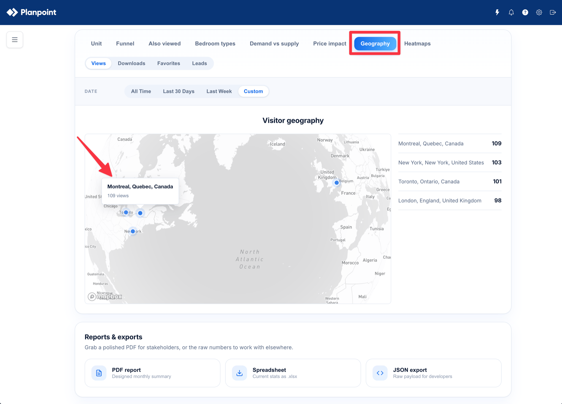
### Geography
A map of approximate visitor locations, with sub-tabs for **Views**, **Downloads**, **Favorites** and **Leads**. Locations are derived from request metadata (city, region, country), never from a lead's form details.
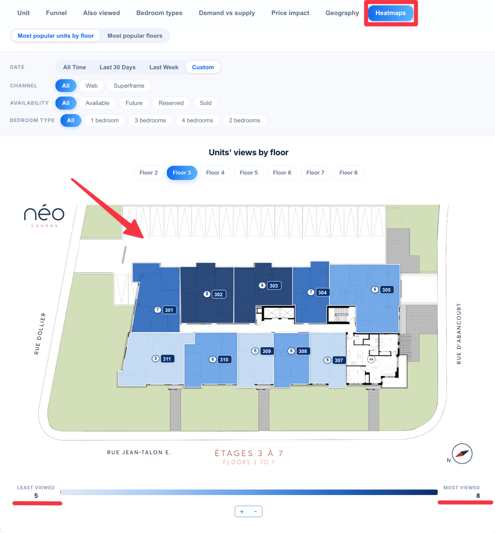
### Heatmaps
Your floorplans and site plans with the units shaded by attention: the more a unit was opened, the stronger it shows. Projects get a heatmap per floor (or per space on commercial projects), plus an overall "most popular floors" view. Groups and enterprises show the same thing nested per project.
## Filtering an enterprise by project
On an enterprise, a **Projects** panel sits at the top of Analytics, above the totals.
Every project in the enterprise starts selected, and the counter reads something like **12 of 12 selected**.
Projects work like tags: click one to drop it from the numbers, click it again to bring it back. The dashboard reloads and shows **Updating analytics...** while it recalculates.
As soon as at least one project is deselected, a **Select all** button appears to put you back to the full enterprise.
The selection is applied everywhere, not just on the charts: KPI totals, every tab, the spreadsheet and JSON exports, the PDF report and the AI summary all follow the projects you picked.
The **Search** tab disappears while a subset of projects is selected. Searchbox queries are made across the whole enterprise before a visitor picks a project, so they can't honestly be attributed to individual projects. Select all projects to see search demand again.Scheduled monthly report emails always cover the full enterprise. The project selection applies to what you're looking at, and to reports you download or send yourself.
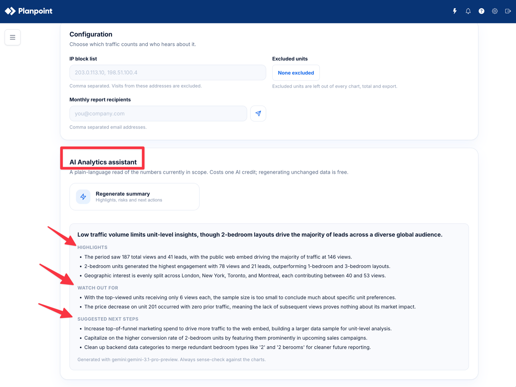
## AI Analytics assistant
At the bottom of the page, **AI Analytics assistant** turns whatever is currently in scope into a plain-language read of the numbers.
Click **Start the assistant** (it becomes **Regenerate summary** once a summary exists) and you get:
* A one line headline
* **Highlights** — what stands out
* **Watch out for** — risks, gaps and data caveats
* **Suggested next steps** — concrete actions
A few things worth knowing:
* Each new summary costs **one AI credit**. Regenerating a summary for data that hasn't changed is free, it's served from cache and clearly labelled as such.
* If generation fails, the credit is refunded automatically.
* Summaries respect your current scope: date range, and on an enterprise, the projects you selected.
* The assistant only receives the aggregated numbers behind the charts. It never receives your leads' names, emails, phone numbers or any other personal detail.
* The footer tells you which model produced the summary and whether it came from cache. It is a reading of your numbers, so always sense-check anything surprising against the charts.
## Reports and exports
The **Reports & exports** panel gives you three ways to take the numbers with you.
A designed, presentation-ready summary of the period, with the KPI totals, unit rankings, bedroom or area breakdowns, demand vs supply, leads and conversion, channels, geography, price impact, also viewed and search demand. Ideal for investors, owners and weekly sales meetings.
The current stats as an `.xlsx` workbook, split into sheets: Summary, Units, Bedroom Types, Area Ranges, Channels, Geography, Leads, By Floor, Price Changes, Price Impact, Also Viewed and Searches. Use it to pivot, sort and merge with your own CRM data.
The same data as a structured JSON payload, for developers feeding Planpoint numbers into another system or a BI tool.
## Configuration
The **Configuration** panel controls which traffic counts and who hears about it.
A comma separated list of IP addresses to ignore, for example `203.0.113.10, 198.51.100.4`. Use it to keep your own sales team, agency and office visits out of the numbers.
Click the button (it reads **None excluded** or **3 excluded**) to open the picker, search by unit name and tick anything that shouldn't be measured, such as test units, model suites or staff-only stock. Their activity is then left out of the charts, the totals and the exports.
A comma separated list of email addresses that should receive the PDF report each month. The send button next to the field emails the current report immediately, which is handy for testing the list or sharing an update mid-month.
## A note on privacy
Analytics is built on aggregated, anonymous behaviour. Visit counts, approximate locations from request metadata, and an anonymous per-browser id used only to work out which units were opened in the same session. Lead contact details live in the **Leads** module and are never mixed into the charts, the exports or anything sent to the AI assistant.
 ## Filtering the charts
Depending on the tab, you also get:
* **Per Availability** — narrow to a status such as Available, Reserved or Sold. The exact options come from your own units.
* **Per Bedroom Type** — narrow to studios, 1 bedroom, 2 bedrooms and so on (residential projects).
* **Per Channel** — split **Web** traffic (your public embed) from **Superframe** traffic (an in‑office sales screen). This filter only appears once at least one Superframe visit has been recorded, so projects that never ran a sales-office screen don't see an empty split.
Filters stack: pick *Last 30 Days* + *Available* + *2 bedrooms* and every chart on the tab follows.
## Filtering the charts
Depending on the tab, you also get:
* **Per Availability** — narrow to a status such as Available, Reserved or Sold. The exact options come from your own units.
* **Per Bedroom Type** — narrow to studios, 1 bedroom, 2 bedrooms and so on (residential projects).
* **Per Channel** — split **Web** traffic (your public embed) from **Superframe** traffic (an in‑office sales screen). This filter only appears once at least one Superframe visit has been recorded, so projects that never ran a sales-office screen don't see an empty split.
Filters stack: pick *Last 30 Days* + *Available* + *2 bedrooms* and every chart on the tab follows.
 ## The tabs
Tabs appear in this order. Any tab that has nothing to show is hidden automatically rather than displayed empty.
### Unit
Bar charts ranking your individual units, with three sub-tabs: **Views**, **Downloads** and **Leads**. This is the fastest way to see your best and worst performing stock.
### Funnel
The **Conversion funnel** shows three stages, **Views → Downloads → Leads**, with each stage's total and its percentage of views (views themselves are always 100%). Use it to see where you lose people: plenty of views but almost no downloads is a very different problem from lots of downloads and no leads.
## The tabs
Tabs appear in this order. Any tab that has nothing to show is hidden automatically rather than displayed empty.
### Unit
Bar charts ranking your individual units, with three sub-tabs: **Views**, **Downloads** and **Leads**. This is the fastest way to see your best and worst performing stock.
### Funnel
The **Conversion funnel** shows three stages, **Views → Downloads → Leads**, with each stage's total and its percentage of views (views themselves are always 100%). Use it to see where you lose people: plenty of views but almost no downloads is a very different problem from lots of downloads and no leads.
 ### Also viewed
"People who opened this unit also opened…". Pick a unit and see which other units share the most visitors. Great for spotting which plans compete with each other, and for suggesting a realistic second option when a buyer's first choice is gone.
This is built from an anonymous per-browser id. It never identifies a person. The tab is hidden if no visitor has opened at least two units.
### Bedroom types / Area
The same **Views / Downloads / Leads** breakdown, grouped by bedroom count. On commercial projects this tab is called **Area** instead and groups by size band: Under 500 sq ft, 500 – 1,000 sq ft, 1,000 – 2,500 sq ft, 2,500 – 5,000 sq ft and 5,000+ sq ft.
### Demand vs supply
Two views:
* **Comparison** — share of views (demand) against share of remaining inventory (supply), per bedroom type or area band. Where demand runs ahead of supply, you're likely underpriced or short on that type; the reverse suggests stock that needs help.
* **Remaining supply** — what's actually left, by bedroom type or area range.
Sold and leased units are not counted as remaining supply.
### Also viewed
"People who opened this unit also opened…". Pick a unit and see which other units share the most visitors. Great for spotting which plans compete with each other, and for suggesting a realistic second option when a buyer's first choice is gone.
This is built from an anonymous per-browser id. It never identifies a person. The tab is hidden if no visitor has opened at least two units.
### Bedroom types / Area
The same **Views / Downloads / Leads** breakdown, grouped by bedroom count. On commercial projects this tab is called **Area** instead and groups by size band: Under 500 sq ft, 500 – 1,000 sq ft, 1,000 – 2,500 sq ft, 2,500 – 5,000 sq ft and 5,000+ sq ft.
### Demand vs supply
Two views:
* **Comparison** — share of views (demand) against share of remaining inventory (supply), per bedroom type or area band. Where demand runs ahead of supply, you're likely underpriced or short on that type; the reverse suggests stock that needs help.
* **Remaining supply** — what's actually left, by bedroom type or area range.
Sold and leased units are not counted as remaining supply.
 ### Price impact
For every recorded price change, this compares views in the **14 days before** against the **14 days after**, so you can see whether a reprice actually moved demand. The tooltip shows the old and new price, the change, and views and leads either side.
The tab only appears once at least one price change has been recorded, and a unit's very first price doesn't count as a change.
### Search
**Enterprise only.** What people typed into your enterprise searchbox, whether or not they clicked anything: **Bedrooms**, **Property type**, **Neighbourhood**, **Price range** and **Status**. This is genuine unmet demand, it tells you what buyers wanted before they saw what you actually have.
### Geography
A map of approximate visitor locations, with sub-tabs for **Views**, **Downloads**, **Favorites** and **Leads**. Locations are derived from request metadata (city, region, country), never from a lead's form details.
### Price impact
For every recorded price change, this compares views in the **14 days before** against the **14 days after**, so you can see whether a reprice actually moved demand. The tooltip shows the old and new price, the change, and views and leads either side.
The tab only appears once at least one price change has been recorded, and a unit's very first price doesn't count as a change.
### Search
**Enterprise only.** What people typed into your enterprise searchbox, whether or not they clicked anything: **Bedrooms**, **Property type**, **Neighbourhood**, **Price range** and **Status**. This is genuine unmet demand, it tells you what buyers wanted before they saw what you actually have.
### Geography
A map of approximate visitor locations, with sub-tabs for **Views**, **Downloads**, **Favorites** and **Leads**. Locations are derived from request metadata (city, region, country), never from a lead's form details.
 ### Heatmaps
Your floorplans and site plans with the units shaded by attention: the more a unit was opened, the stronger it shows. Projects get a heatmap per floor (or per space on commercial projects), plus an overall "most popular floors" view. Groups and enterprises show the same thing nested per project.
### Heatmaps
Your floorplans and site plans with the units shaded by attention: the more a unit was opened, the stronger it shows. Projects get a heatmap per floor (or per space on commercial projects), plus an overall "most popular floors" view. Groups and enterprises show the same thing nested per project.
 ## Filtering an enterprise by project
On an enterprise, a **Projects** panel sits at the top of Analytics, above the totals.
## Filtering an enterprise by project
On an enterprise, a **Projects** panel sits at the top of Analytics, above the totals.
 A few things worth knowing:
* Each new summary costs **one AI credit**. Regenerating a summary for data that hasn't changed is free, it's served from cache and clearly labelled as such.
* If generation fails, the credit is refunded automatically.
* Summaries respect your current scope: date range, and on an enterprise, the projects you selected.
* The assistant only receives the aggregated numbers behind the charts. It never receives your leads' names, emails, phone numbers or any other personal detail.
* The footer tells you which model produced the summary and whether it came from cache. It is a reading of your numbers, so always sense-check anything surprising against the charts.
## Reports and exports
The **Reports & exports** panel gives you three ways to take the numbers with you.
A few things worth knowing:
* Each new summary costs **one AI credit**. Regenerating a summary for data that hasn't changed is free, it's served from cache and clearly labelled as such.
* If generation fails, the credit is refunded automatically.
* Summaries respect your current scope: date range, and on an enterprise, the projects you selected.
* The assistant only receives the aggregated numbers behind the charts. It never receives your leads' names, emails, phone numbers or any other personal detail.
* The footer tells you which model produced the summary and whether it came from cache. It is a reading of your numbers, so always sense-check anything surprising against the charts.
## Reports and exports
The **Reports & exports** panel gives you three ways to take the numbers with you.