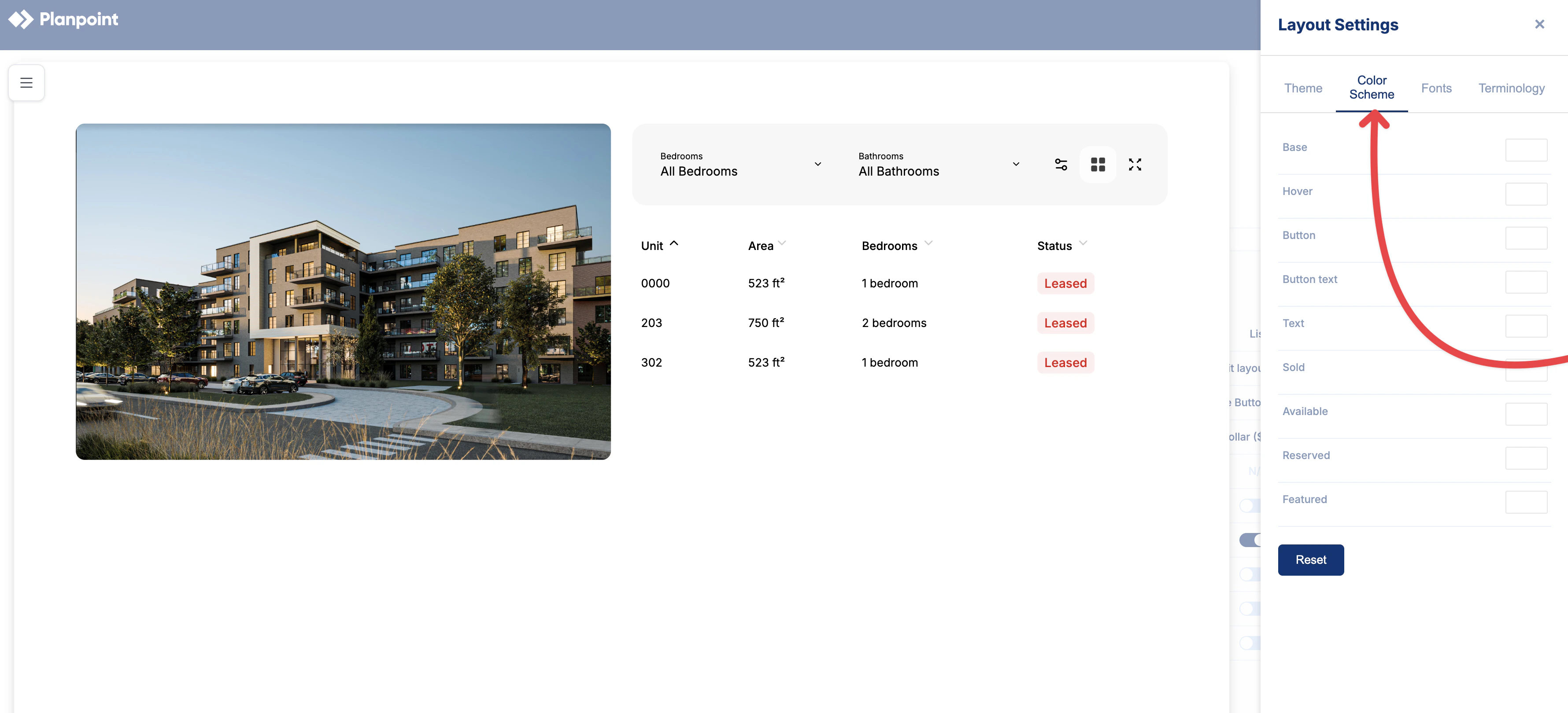
The Color module allows you to customize the color palette of the plan viewer so it better reflects your brand and visual preferences. You can define colors for key interface elements, including the background of the viewer, hover interactions where floors and plans are highlighted, buttons and button text, general text, and unit status indicators such as available, reserved, sold, and featured.Exterior shapes use the Hover color by default. To use the status colors on the exterior instead, enable Availabilities and Use availability colors on exterior under Settings → Customization → Availabilities. See Exterior for how colors are selected when a floor contains units with different statuses.All changes are applied immediately, allowing you to preview and fine-tune your styling in real time. Colors can be set using any HEX or RGB value, providing full flexibility and precision.If you want to edit your color scheme, simply follow the instructions below:
1
Step 1
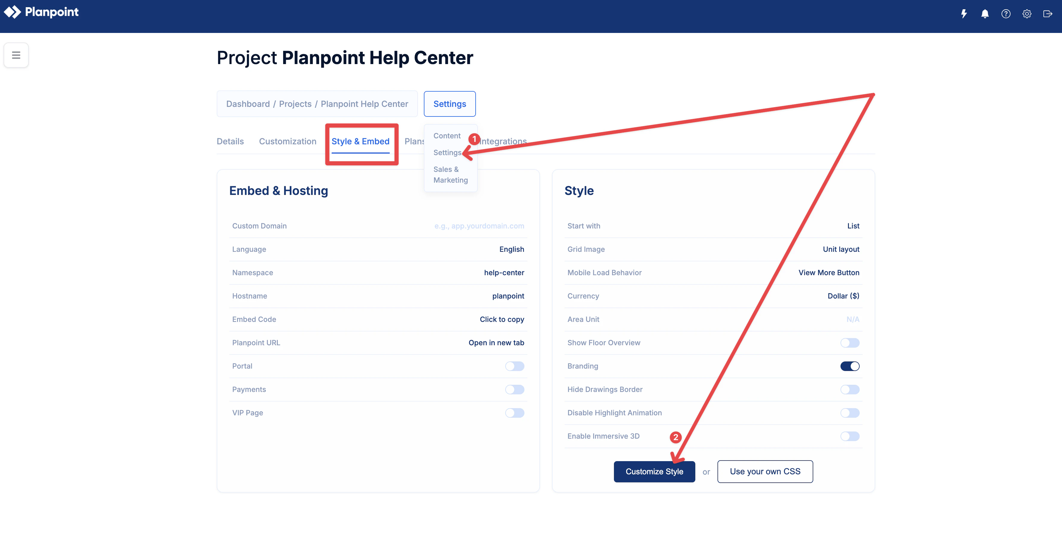
Go to Settings. Under Style & Embed, select Customize Style.
2
Step 2
Once there, select Color Scheme.
You can make use of transparency by using the transparency slider as you see in the video below. A slightly transparent color is preferable over a completely opaque one, as it will show some details about the building and floor plan.
{"docsConfig":{"theme":"mint","$schema":"https://mintlify.com/docs.json","name":"Planpoint Viewer Docs","colors":{"primary":"#0f68ea","light":"#f0f2f4","dark":"#0f68ea"},"logo":{"light":"https://mintcdn.com/planpoint/ygbSuV-niiq46Suq/logo/light.svg?fit=max\u0026auto=format\u0026n=ygbSuV-niiq46Suq\u0026q=85\u0026s=7799fb568d5d530467492a989784f18f","dark":"https://mintcdn.com/planpoint/nX9odRMiqNApqjCO/logo/dark.svg?fit=max\u0026auto=format\u0026n=nX9odRMiqNApqjCO\u0026q=85\u0026s=675e18f4bdd6a73fbb28bac2c6dfb407"},"favicon":"https://mintcdn.com/planpoint/nX9odRMiqNApqjCO/favicon.svg?fit=max\u0026auto=format\u0026n=nX9odRMiqNApqjCO\u0026q=85\u0026s=4e4b98d26a99a5cb92a601bb8d469c83","navbar":{"links":[{"href":"mailto:support@planpoint.io","label":"Support"}],"primary":{"type":"button","label":"Dashboard","href":"https://app.planpoint.io/login"}},"footer":{"socials":{"instagram":"https://www.instagram.com/planpoint.io","linkedin":"https://www.linkedin.com/company/68575632","github":"https://github.com/"}},"styling":{"latex":false},"navigation":{"pages":[]}},"deployment":{"deploymentMetadataValue":{"subdomain":"planpoint","hasAudioNarration":false,"actualSubdomain":"planpoint","customDomains":["viewerdocs.planpoint.io"],"gitSource":{"type":"github","owner":"planpoint-io","repo":"planpoint-viewerdocs","deployBranch":"main","contentDirectory":"","isPrivate":false,"mountPath":"","label":""},"chroma":{"liveDeploymentHistoryId":"6ad240b87414c95fc10fe53f","collectionId":"e116f7be-2851-481e-bb2b-d296c3a0caae","schemaVersion":"v3","latestBuiltDeploymentHistoryId":"6ad240b87414c95fc10fe53f"},"entitlements":{},"buildId":"6ad240b87414c95fc10fe53f","clientVersion":"0.0.3966","searchFilterCounts":[{"language":"default","tag":"Documentation","count":62},{"language":"default","tag":"General","count":36},{"language":"default","tag":"Advanced Features","count":21},{"language":"default","tag":"API ","count":20},{"language":"default","tag":"Creation","count":10},{"language":"default","tag":"SDK","count":6},{"language":"default","tag":"SDK Documentation","count":6},{"language":"default","tag":"Units","count":5},{"language":"default","tag":"Editing and Management","count":5},{"language":"default","tag":"Floors","count":4}]},"assistantConfig":{},"hasChatPermissions":false,"hasWebMcpPermissions":false,"toggles":[{"name":"kill-isr","enabled":true,"variant":{"name":"disabled","enabled":false,"feature_enabled":true},"impressionData":false},{"name":"agent-mintlify-slack","enabled":true,"variant":{"name":"disabled","enabled":false,"feature_enabled":true},"impressionData":false},{"name":"editor-v7-file-tree","enabled":true,"variant":{"name":"disabled","enabled":false,"feature_enabled":true},"impressionData":false},{"name":"agent-integrations-settings","enabled":true,"variant":{"name":"disabled","enabled":false,"feature_enabled":true},"impressionData":false},{"name":"automations-pr-grouping","enabled":true,"variant":{"name":"disabled","enabled":false,"feature_enabled":true},"impressionData":false},{"name":"custom-prefix","enabled":true,"variant":{"name":"disabled","enabled":false,"feature_enabled":true},"impressionData":false},{"name":"analytics-v7","enabled":true,"variant":{"name":"disabled","enabled":false,"feature_enabled":true},"impressionData":false},{"name":"user-flows-analytics","enabled":true,"variant":{"name":"disabled","enabled":false,"feature_enabled":true},"impressionData":false},{"name":"no-publish-flow","enabled":true,"variant":{"name":"disabled","enabled":false,"feature_enabled":true},"impressionData":false},{"name":"workos-onboarding","enabled":true,"variant":{"name":"disabled","enabled":false,"feature_enabled":true},"impressionData":false},{"name":"llms-txt-v2","enabled":true,"variant":{"name":"disabled","enabled":false,"feature_enabled":true},"impressionData":false},{"name":"pause-universal-search-reconcile","enabled":true,"variant":{"name":"disabled","enabled":false,"feature_enabled":true},"impressionData":false},{"name":"snapshot-serving-live","enabled":true,"variant":{"name":"disabled","enabled":false,"feature_enabled":true},"impressionData":false},{"name":"stripTemperatureMiddleware","enabled":true,"variant":{"name":"disabled","enabled":false,"feature_enabled":true},"impressionData":false},{"name":"per-site-search-delta","enabled":true,"variant":{"name":"disabled","enabled":false,"feature_enabled":true},"impressionData":false},{"name":"support-platform-pylon-zendesk","enabled":true,"variant":{"name":"disabled","enabled":false,"feature_enabled":true},"impressionData":false},{"name":"snapshot-serving","enabled":true,"variant":{"name":"disabled","enabled":false,"feature_enabled":true},"impressionData":false},{"name":"instant-rollback","enabled":true,"variant":{"name":"disabled","enabled":false,"feature_enabled":true},"impressionData":false},{"name":"granular-notifications-server","enabled":true,"variant":{"name":"disabled","enabled":false,"feature_enabled":true},"impressionData":false},{"name":"granular-notifications","enabled":true,"variant":{"name":"disabled","enabled":false,"feature_enabled":true},"impressionData":false},{"name":"editor-private-page-search","enabled":true,"variant":{"name":"disabled","enabled":false,"feature_enabled":true},"impressionData":false},{"name":"automations-fable","enabled":true,"variant":{"name":"disabled","enabled":false,"feature_enabled":true},"impressionData":false},{"name":"fixed-ai-action-pricing","enabled":true,"variant":{"name":"disabled","enabled":false,"feature_enabled":true},"impressionData":false},{"name":"automation-resolve-merge-conflict","enabled":true,"variant":{"name":"disabled","enabled":false,"feature_enabled":true},"impressionData":false},{"name":"scoped-publishing","enabled":true,"variant":{"name":"disabled","enabled":false,"feature_enabled":true},"impressionData":false},{"name":"mintql","enabled":true,"variant":{"name":"disabled","enabled":false,"feature_enabled":true},"impressionData":false},{"name":"page-level-analytics","enabled":true,"variant":{"name":"disabled","enabled":false,"feature_enabled":true},"impressionData":false},{"name":"editor-version-history-v2","enabled":true,"variant":{"name":"disabled","enabled":false,"feature_enabled":true},"impressionData":false},{"name":"editor-nav-generations","enabled":true,"variant":{"name":"disabled","enabled":false,"feature_enabled":true},"impressionData":false},{"name":"billing-page-v2","enabled":true,"variant":{"name":"disabled","enabled":false,"feature_enabled":true},"impressionData":false},{"name":"workspace-projects","enabled":true,"variant":{"name":"disabled","enabled":false,"feature_enabled":true},"impressionData":false},{"name":"assistant-v5","enabled":true,"variant":{"name":"disabled","enabled":false,"feature_enabled":true},"impressionData":false},{"name":"byok-sep-25","enabled":true,"variant":{"name":"disabled","enabled":false,"feature_enabled":true},"impressionData":false},{"name":"fork-pr-previews","enabled":true,"variant":{"name":"disabled","enabled":false,"feature_enabled":true},"impressionData":false},{"name":"revalidation-jwt","enabled":true,"variant":{"name":"disabled","enabled":false,"feature_enabled":true},"impressionData":false},{"name":"vite-origin","enabled":true,"variant":{"name":"disabled","enabled":false,"feature_enabled":true},"impressionData":false},{"name":"editor-agent-model-picker","enabled":true,"variant":{"name":"disabled","enabled":false,"feature_enabled":true},"impressionData":false},{"name":"billing-updated-9-15","enabled":true,"variant":{"name":"disabled","enabled":false,"feature_enabled":true},"impressionData":false},{"name":"hobby-abuse-scan","enabled":true,"variant":{"name":"disabled","enabled":false,"feature_enabled":true},"impressionData":false},{"name":"dashboard-inbox","enabled":true,"variant":{"name":"disabled","enabled":false,"feature_enabled":true},"impressionData":false}],"isAtlas":false,"googleFontsInlined":false},"customCss":[],"page":{"pagePath":"colors","slug":"/colors","pageMetadata":{"title":"Colors","description":null,"href":"/colors"},"pageType":"default","mdx":{"mdxSource":{"compiledSource":"\"use strict\";const{Fragment:_Fragment,jsx:_jsx,jsxs:_jsxs}=arguments[0];const{useMDXComponents:_provideComponents}=arguments[0];function _createMdxContent(props){const _components={a:`a`,p:`p`,strong:`strong`,..._provideComponents(),...props.components},{Frame,OptimizedFrame,OptimizedImage,Step,Steps,Tip}=_components;if(!Frame)_missingMdxReference(`Frame`,true);if(!OptimizedFrame)_missingMdxReference(`OptimizedFrame`,true);if(!OptimizedImage)_missingMdxReference(`OptimizedImage`,true);if(!Step)_missingMdxReference(`Step`,true);if(!Steps)_missingMdxReference(`Steps`,true);if(!Tip)_missingMdxReference(`Tip`,true);return _jsxs(_Fragment,{children:[_jsx(_components.p,{children:`The Color module allows you to customize the color palette of the plan viewer so it better reflects your brand and visual preferences. You can define colors for key interface elements, including the background of the viewer, hover interactions where floors and plans are highlighted, buttons and button text, general text, and unit status indicators such as available, reserved, sold, and featured.`}),`\n`,_jsxs(_components.p,{children:[`Exterior shapes use the `,_jsx(_components.strong,{children:`Hover`}),` color by default. To use the status colors on the exterior instead, enable `,_jsx(_components.strong,{children:`Availabilities`}),` and `,_jsx(_components.strong,{children:`Use availability colors on exterior`}),` under `,_jsx(_components.strong,{children:`Settings → Customization → Availabilities`}),`. See `,_jsx(_components.a,{href:`/exterior#exterior-hover-colors`,children:`Exterior`}),` for how colors are selected when a floor contains units with different statuses.`]}),`\n`,_jsx(_components.p,{children:`All changes are applied immediately, allowing you to preview and fine-tune your styling in real time. Colors can be set using any HEX or RGB value, providing full flexibility and precision.`}),`\n`,_jsx(_components.p,{children:`If you want to edit your color scheme, simply follow the instructions below:`}),`\n`,_jsxs(Steps,{children:[_jsxs(Step,{title:`Step 1`,children:[_jsxs(_components.p,{children:[`Go to `,_jsx(_components.strong,{children:`Settings`}),`. Under `,_jsx(_components.strong,{children:`Style \u0026 Embed`}),`, select `,_jsx(_components.strong,{children:`Customize Style`}),`.`]}),_jsx(Frame,{children:_jsx(OptimizedImage,{src:`https://mintcdn.com/planpoint/BOA0Qwv7rRjZfGxW/colors1.jpg?fit=max\u0026auto=format\u0026n=BOA0Qwv7rRjZfGxW\u0026q=85\u0026s=3de12c3a6e00867bfd44f6f2eecd55a9`,alt:``,\"data-og-width\":`3548`,width:`3548`,\"data-og-height\":`1780`,height:`1780`,\"data-path\":`colors1.jpg`,\"data-optimize\":`true`,\"data-opv\":`3`,srcset:`https://mintcdn.com/planpoint/BOA0Qwv7rRjZfGxW/colors1.jpg?w=280\u0026fit=max\u0026auto=format\u0026n=BOA0Qwv7rRjZfGxW\u0026q=85\u0026s=7e5abe6a90b65e65f170b5be06e5778d 280w, https://mintcdn.com/planpoint/BOA0Qwv7rRjZfGxW/colors1.jpg?w=560\u0026fit=max\u0026auto=format\u0026n=BOA0Qwv7rRjZfGxW\u0026q=85\u0026s=a5221c750720bc39ab5c81b7821df9a7 560w, https://mintcdn.com/planpoint/BOA0Qwv7rRjZfGxW/colors1.jpg?w=840\u0026fit=max\u0026auto=format\u0026n=BOA0Qwv7rRjZfGxW\u0026q=85\u0026s=c30f12d44e1f675effe8407183f976d1 840w, https://mintcdn.com/planpoint/BOA0Qwv7rRjZfGxW/colors1.jpg?w=1100\u0026fit=max\u0026auto=format\u0026n=BOA0Qwv7rRjZfGxW\u0026q=85\u0026s=86c61f6760317cedfdb3bb0d2e713c81 1100w, https://mintcdn.com/planpoint/BOA0Qwv7rRjZfGxW/colors1.jpg?w=1650\u0026fit=max\u0026auto=format\u0026n=BOA0Qwv7rRjZfGxW\u0026q=85\u0026s=e5cf90716937fa5047f445c638773889 1650w, https://mintcdn.com/planpoint/BOA0Qwv7rRjZfGxW/colors1.jpg?w=2500\u0026fit=max\u0026auto=format\u0026n=BOA0Qwv7rRjZfGxW\u0026q=85\u0026s=be0acd2069dd43bfdcb07f073e372835 2500w`})})]}),_jsxs(Step,{title:`Step 2`,children:[_jsxs(_components.p,{children:[`Once there, select `,_jsx(_components.strong,{children:`Color Scheme`}),`.`]}),_jsx(Frame,{children:_jsx(OptimizedImage,{src:`https://mintcdn.com/planpoint/BOA0Qwv7rRjZfGxW/colors2.jpg?fit=max\u0026auto=format\u0026n=BOA0Qwv7rRjZfGxW\u0026q=85\u0026s=a9bf3a7e3bca499775549159460492b4`,alt:``,\"data-og-width\":`3560`,width:`3560`,\"data-og-height\":`1620`,height:`1620`,\"data-path\":`colors2.jpg`,\"data-optimize\":`true`,\"data-opv\":`3`,srcset:`https://mintcdn.com/planpoint/BOA0Qwv7rRjZfGxW/colors2.jpg?w=280\u0026fit=max\u0026auto=format\u0026n=BOA0Qwv7rRjZfGxW\u0026q=85\u0026s=9b5d2191681fd49fb7dd7a27cbc08e24 280w, https://mintcdn.com/planpoint/BOA0Qwv7rRjZfGxW/colors2.jpg?w=560\u0026fit=max\u0026auto=format\u0026n=BOA0Qwv7rRjZfGxW\u0026q=85\u0026s=39c21c117f47f43041ba6047d1136a10 560w, https://mintcdn.com/planpoint/BOA0Qwv7rRjZfGxW/colors2.jpg?w=840\u0026fit=max\u0026auto=format\u0026n=BOA0Qwv7rRjZfGxW\u0026q=85\u0026s=d3f7c4090b8235ab3dd4eed11eca7fc9 840w, https://mintcdn.com/planpoint/BOA0Qwv7rRjZfGxW/colors2.jpg?w=1100\u0026fit=max\u0026auto=format\u0026n=BOA0Qwv7rRjZfGxW\u0026q=85\u0026s=3d996e09b30f99397893d19e86312fc5 1100w, https://mintcdn.com/planpoint/BOA0Qwv7rRjZfGxW/colors2.jpg?w=1650\u0026fit=max\u0026auto=format\u0026n=BOA0Qwv7rRjZfGxW\u0026q=85\u0026s=7f47c215170f05d6b0d059d4199b2e35 1650w, https://mintcdn.com/planpoint/BOA0Qwv7rRjZfGxW/colors2.jpg?w=2500\u0026fit=max\u0026auto=format\u0026n=BOA0Qwv7rRjZfGxW\u0026q=85\u0026s=9e6e1d3d4f49d3b28f97816601951acd 2500w`})})]})]}),`\n`,_jsx(Tip,{children:_jsx(_components.p,{children:`You can make use of transparency by using the transparency slider as you see in the video below. A slightly transparent color is preferable over a completely opaque one, as it will show some details about the building and floor plan.`})}),`\n`,_jsx(OptimizedFrame,{src:`https://streamable.com/e/3wa7em`,width:`100%`,height:`400px`})]})}function MDXContent(props={}){const{wrapper:MDXLayout}={..._provideComponents(),...props.components};return MDXLayout?_jsx(MDXLayout,{...props,children:_jsx(_createMdxContent,{...props})}):_createMdxContent(props)}return{default:MDXContent};function _missingMdxReference(id,component){throw new Error(`Expected `+(component?`component`:`object`)+\" `\"+id+\"` to be defined: you likely forgot to import, pass, or provide it.\")}","frontmatter":{},"scope":{"config":{},"pageMetadata":{"title":"Colors","description":null,"href":"/colors"}}},"mdxSourceWithNoJs":null},"mdxExtracts":{"tableOfContents":[],"codeExamples":{}},"jsLinks":[],"subdomain":"planpoint","siteName":"Planpoint Viewer Docs","title":"Colors - Planpoint Viewer Docs","navMaps":{"firstHrefInVersion":{},"firstHrefInLanguage":{}},"lastModified":"2026-10-11T19:17:45.645Z","originalFileLocation":"colors.mdx"},"headHtml":"\u003cscript data-mint-head>(function(){var d=document.documentElement,p=null;if(!p){try{p=localStorage.getItem(\"isDarkMode\")}catch(e){}if(p==='true')p='dark';else if(p==='false')p='light';if(p!=='light'\u0026\u0026p!=='dark'\u0026\u0026p!=='system')p=\"system\"}var r=p==='system'?(matchMedia(\"(prefers-color-scheme: dark)\").matches?'dark':'light'):p;d.classList.remove(r==='dark'?'light':'dark');d.classList.add(r);d.setAttribute(\"data-theme-preference\",p)})();\u003c/script>\u003cmeta data-mint-head name=\"application-name\" content=\"Planpoint Viewer Docs\">\u003cmeta data-mint-head name=\"generator\" content=\"Mintlify\">\u003clink data-mint-head rel=\"icon\" type=\"image/png\" sizes=\"192x192\" href=\"/mintlify-assets/_mintlify/favicons/planpoint/I4H3ZgKgth9zmV2U/_generated/favicon/android-chrome-192x192.png\" media=\"(prefers-color-scheme: light)\">\u003clink data-mint-head rel=\"apple-touch-icon\" type=\"image/png\" sizes=\"180x180\" href=\"/mintlify-assets/_mintlify/favicons/planpoint/I4H3ZgKgth9zmV2U/_generated/favicon/apple-touch-icon.png\">\u003clink data-mint-head rel=\"icon\" type=\"image/png\" sizes=\"16x16\" href=\"/mintlify-assets/_mintlify/favicons/planpoint/I4H3ZgKgth9zmV2U/_generated/favicon/favicon-16x16.png\" media=\"(prefers-color-scheme: light)\">\u003clink data-mint-head rel=\"icon\" type=\"image/png\" sizes=\"32x32\" href=\"/mintlify-assets/_mintlify/favicons/planpoint/I4H3ZgKgth9zmV2U/_generated/favicon/favicon-32x32.png\" media=\"(prefers-color-scheme: light)\">\u003clink data-mint-head rel=\"shortcut icon\" type=\"image/x-icon\" href=\"/mintlify-assets/_mintlify/favicons/planpoint/I4H3ZgKgth9zmV2U/_generated/favicon/favicon.ico\" media=\"(prefers-color-scheme: light)\">\u003clink data-mint-head rel=\"icon\" type=\"image/png\" sizes=\"192x192\" href=\"/mintlify-assets/_mintlify/favicons/planpoint/I4H3ZgKgth9zmV2U/_generated/favicon-dark/android-chrome-192x192.png\" media=\"(prefers-color-scheme: dark)\">\u003clink data-mint-head rel=\"icon\" type=\"image/png\" sizes=\"16x16\" href=\"/mintlify-assets/_mintlify/favicons/planpoint/I4H3ZgKgth9zmV2U/_generated/favicon-dark/favicon-16x16.png\" media=\"(prefers-color-scheme: dark)\">\u003clink data-mint-head rel=\"icon\" type=\"image/png\" sizes=\"32x32\" href=\"/mintlify-assets/_mintlify/favicons/planpoint/I4H3ZgKgth9zmV2U/_generated/favicon-dark/favicon-32x32.png\" media=\"(prefers-color-scheme: dark)\">\u003clink data-mint-head rel=\"shortcut icon\" type=\"image/x-icon\" href=\"/mintlify-assets/_mintlify/favicons/planpoint/I4H3ZgKgth9zmV2U/_generated/favicon-dark/favicon.ico\" media=\"(prefers-color-scheme: dark)\">\u003cmeta data-mint-head property=\"og:title\" content=\"Colors - Planpoint Viewer Docs\">\u003cmeta data-mint-head property=\"og:site_name\" content=\"Planpoint Viewer Docs\">\u003cmeta data-mint-head property=\"og:url\" content=\"https://viewerdocs.planpoint.io/colors\">\u003cmeta data-mint-head property=\"og:type\" content=\"website\">\u003cmeta data-mint-head property=\"og:image\" content=\"https://planpoint.mintlify.app/_mintlify/api/og/v2?division=Editing+and+Management\u0026amp;title=Colors\u0026amp;theme=0ba8030471b2f14b1bff3f40\u0026amp;signature=5e21cf78902ba7b52b3816a5fb3d62d87a2e1748b784c3469651c6e15deb77e2\">\u003cmeta data-mint-head property=\"og:image:width\" content=\"1200\">\u003cmeta data-mint-head property=\"og:image:height\" content=\"630\">\u003cmeta data-mint-head name=\"twitter:card\" content=\"summary_large_image\">\u003cmeta data-mint-head name=\"twitter:title\" content=\"Colors - Planpoint Viewer Docs\">\u003cmeta data-mint-head name=\"twitter:image\" content=\"https://planpoint.mintlify.app/_mintlify/api/og/v2?division=Editing+and+Management\u0026amp;title=Colors\u0026amp;theme=0ba8030471b2f14b1bff3f40\u0026amp;signature=5e21cf78902ba7b52b3816a5fb3d62d87a2e1748b784c3469651c6e15deb77e2\">\u003cmeta data-mint-head name=\"twitter:image:width\" content=\"1200\">\u003cmeta data-mint-head name=\"twitter:image:height\" content=\"630\">\u003cmeta data-mint-head name=\"msapplication-config\" content=\"/mintlify-assets/_mintlify/favicons/planpoint/I4H3ZgKgth9zmV2U/_generated/favicon/browserconfig.xml\">\u003cmeta data-mint-head name=\"apple-mobile-web-app-title\" content=\"Planpoint Viewer Docs\">\u003cmeta data-mint-head name=\"msapplication-TileColor\" content=\"#0f68ea\">\u003clink data-mint-head rel=\"canonical\" href=\"https://viewerdocs.planpoint.io/colors\">\u003clink data-mint-head rel=\"alternate\" type=\"application/xml\" href=\"/sitemap.xml\">\u003clink data-mint-head rel=\"alternate\" type=\"text/markdown\" href=\"/colors.md\">\u003cscript data-mint-head type=\"application/ld+json\">{\"@context\":\"https://schema.org\",\"@graph\":[{\"@type\":\"Organization\",\"@id\":\"https://viewerdocs.planpoint.io/#organization\",\"name\":\"Planpoint Viewer Docs\",\"url\":\"https://viewerdocs.planpoint.io\",\"logo\":{\"@type\":\"ImageObject\",\"url\":\"https://mintcdn.com/planpoint/ygbSuV-niiq46Suq/logo/light.svg?fit=max\u0026auto=format\u0026n=ygbSuV-niiq46Suq\u0026q=85\u0026s=7799fb568d5d530467492a989784f18f\"}},{\"@type\":\"WebSite\",\"@id\":\"https://viewerdocs.planpoint.io#website\",\"name\":\"Planpoint Viewer Docs\",\"url\":\"https://viewerdocs.planpoint.io\",\"publisher\":{\"@id\":\"https://viewerdocs.planpoint.io/#organization\"}},{\"@type\":\"WebPage\",\"@id\":\"https://viewerdocs.planpoint.io/colors#webpage\",\"url\":\"https://viewerdocs.planpoint.io/colors\",\"name\":\"Colors\",\"dateModified\":\"2026-10-11T19:17:45.645Z\",\"isPartOf\":{\"@id\":\"https://viewerdocs.planpoint.io#website\"},\"breadcrumb\":{\"@id\":\"https://viewerdocs.planpoint.io/colors#breadcrumb\"}},{\"@type\":\"BreadcrumbList\",\"@id\":\"https://viewerdocs.planpoint.io/colors#breadcrumb\",\"itemListElement\":[{\"@type\":\"ListItem\",\"position\":1,\"name\":\"Editing and Management\",\"item\":\"https://viewerdocs.planpoint.io/edit-info\"},{\"@type\":\"ListItem\",\"position\":2,\"name\":\"Colors\",\"item\":\"https://viewerdocs.planpoint.io/colors\"}]},{\"@type\":[\"Article\",\"TechArticle\"],\"@id\":\"https://viewerdocs.planpoint.io/colors#article\",\"headline\":\"Colors\",\"name\":\"Colors\",\"url\":\"https://viewerdocs.planpoint.io/colors\",\"mainEntityOfPage\":{\"@id\":\"https://viewerdocs.planpoint.io/colors#webpage\"},\"dateModified\":\"2026-10-11T19:17:45.645Z\",\"publisher\":{\"@id\":\"https://viewerdocs.planpoint.io/#organization\"},\"isPartOf\":{\"@id\":\"https://viewerdocs.planpoint.io#website\"}}]}\u003c/script>\u003cscript data-mint-head type=\"application/ld+json\">{\"@context\":\"https://schema.org\",\"@type\":\"WebSite\",\"name\":\"Planpoint Viewer Docs\",\"creator\":{\"@type\":\"Organization\",\"name\":\"Mintlify\",\"url\":\"https://mintlify.com\"}}\u003c/script>","siteName":"Planpoint Viewer Docs","nav":{"global":null,"anchors":[{"anchor":"Documentation","icon":"book-open","tabs":[{"tab":"General","groups":[{"group":"Creation","pages":[{"title":"Welcome","href":"/welcome"},{"title":"Checklist","href":"/checklist"},{"title":"Settings","href":"/settings"},{"title":"Exterior","href":"/exterior"},{"title":"Units","href":"/units"},{"title":"Collections","href":"/collections"},{"title":"Floors","href":"/floors"},{"title":"Media Gallery","href":"/media-gallery"},{"title":"Style \u0026 Embed","href":"/preview-embed"},{"title":"Form","href":"/documentation/general/advanced-features/forms"}]},{"group":"Editing and Management","pages":[{"title":"Change information","href":"/edit-info"},{"title":"Members","href":"/members"},{"title":"Themes","description":null,"href":"/documentation/general/editing-and-management/themes"},{"title":"Colors","href":"/colors"},{"title":"Terminology","description":null,"href":"/documentation/general/editing-and-management/terminology"}]},{"group":"Advanced Features","pages":[{"title":"Group project","href":"/multi-phase"},{"title":"Enterprise","href":"/enterprise-new"},{"title":"Enterprise Map \u0026 Points of Interest","href":"/enterprise-map-embed"},{"title":"360° project","href":"/360"},{"title":"Spotlight Mode","href":"/spotlight"},{"title":"Custom CSS","href":"/custom-css"},{"title":"Homes \u0026 Land","href":"/homes-land"},{"title":"Unit variants","href":"/unit-variants"},{"title":"Choice of Finishes","href":"/custom-finishes"},{"title":"Superframe \u0026 Touchscreen TVs","href":"/superframe"},{"title":"PostMessage Tracking","href":"/documentation/general/advanced-features/post-message"},{"title":"Analytics","href":"/analytics"},{"title":"Conversion Tracking","href":"/conversion-tracking"},{"title":"SEO indexing","href":"/documentation/general/advanced-features/untitled-page"},{"title":"Deep Linking to specific units","href":"/link-units"},{"title":"Amenities and parking","href":"/amenities-parkings"},{"title":"Custom buttons","href":"/custom-buttons"},{"title":"Allocations","href":"/allocations"},{"title":"Zapier Integration with Planpoint","href":"/zapier"},{"title":"Lock Screen","href":"/lock-screen"},{"title":"Payments","href":"/payments"}]}]},{"tab":"API ","pages":[{"title":"API ","href":"/api-documentation/introduction"}]},{"tab":"SDK","pages":[{"title":"SDK","href":"/sdk-documentation/introduction"}]}]},{"anchor":"New releases","icon":"newspaper","href":"https://www.planpoint.io/new-releases/updates"},{"anchor":"Main website","icon":"globe","href":"https://www.planpoint.io/"},{"anchor":"Support","icon":"envelope-dot","href":"mailto:support@planpoint.io"}]},"title":"Colors - Planpoint Viewer Docs","buildId":"dpl_cadrRc5H9XQiJQbDFN5mcYRs2PAj","deploymentId":"dpl_cadrRc5H9XQiJQbDFN5mcYRs2PAj","dynamics":["07c022d89b","a74be98ba7"],"chunks":["Frame-B0bJ23PC.js","DynamicMarkdown-UGQuxDKp.js","zoom-image-lightbox-B0E5HDf_.js","lightbox-handle-r17bVUz3.js"]}